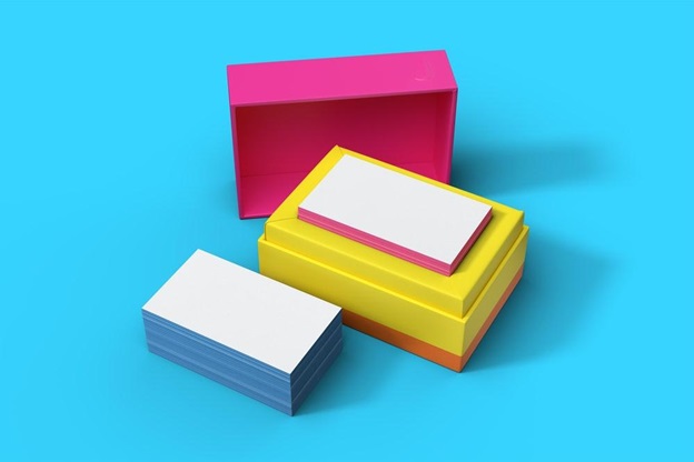
Business cards are a powerful tool, particular when designed professionally and impressively. Designing business cards that stylishly and effectively reflect yourself, your business and the work that you do is as simple as sticking to a few rules of thumb. Following guidelines will help you to produce cards that extend your personal brand and expand your networking reach. Here are ten things to keep in mind when getting your business card designed for the best outcome possible…
Find the right font size
You’ll want to avoid either going too big or too small with your font. The incorrect size will throw off your entire design, no matter how slick and aesthetically pleasing it might have been. Choose a size that works with the font that you’ve chosen for yourself, as the ideal choice is going to vary from style to style. Try out a few variants to find the perfect fit for your compact but powerful business card.
Choose a colour palette
Once you’ve got the basic mechanics of your design all figured out, you can take a look at the colour profile that you’d like to use. Following a predetermined colour palette will add a professional edge and keep your cards from looking homemade or amateur. Keep your colours simple and try to only pick two or three different tones (including the background) to ensure that they are going to be readable and aesthetically pleasing.
Get down to specifics
It can be tempting to try to use that business card of yours to flex your creativity or have a way with words, but it’s really best just to keep things simple and to the point. Add specifics such as your name, contact information, position and company with maybe one extra bit of writing for a little flair if you have the room, and that’s a big if. Specifics will always be best when you’re tight on space.
Proofread it perfectly
This one is super easy if you’ve been minimal with the details on your business card! You want to be absolutely certain that your business cards are free from any spelling errors, awkward phrases or out of date information. There is so little to look at on a business card that even the tiniest of mistakes is going to stick out like a sore thumb, so take the time to proofread as perfectly as you possibly can.
Think tactile
Keep in mind that your business card is going to be carried and held by everyone that you choose to give it to. This is one of the few and fleeting means of giving somebody something tangible to remember you by, so why not take advantage of that fact and choose a tactile, high quality paper surface to print your business cards on. Tactile materials will really set your card apart from the rest and create a valuable lasting impression on all recipients.
Add socials
Do not forget to add your professional social media pages onto that business card of yours! Whilst your more personal and private accounts can absolutely be saved for your nearest and dearest, you might want to establish or share a professional profile on a few different platforms, just to give yourself the extra edge. Add social handles to make lasting connections with your network!
Prioritise quality
Lastly, always ensure that you are prioritising the quality of your business card every step of the way. The card provider that you choose to work with should be reputable and accommodating to your needs in order to create an end product that you truly feel embodies who you are, what you do and the worth you possess! You should also invest in secure business card holders to keep them in pristine condition when you’re out and about!

